Recent charts
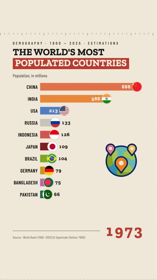
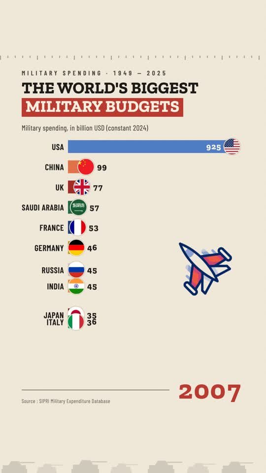
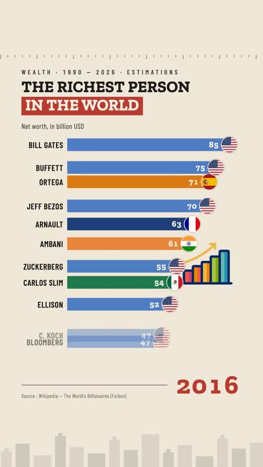
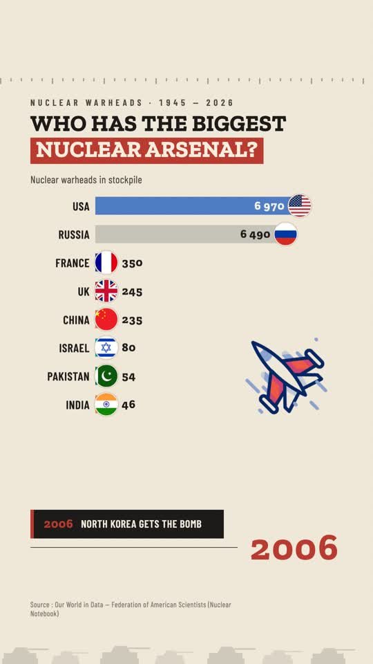
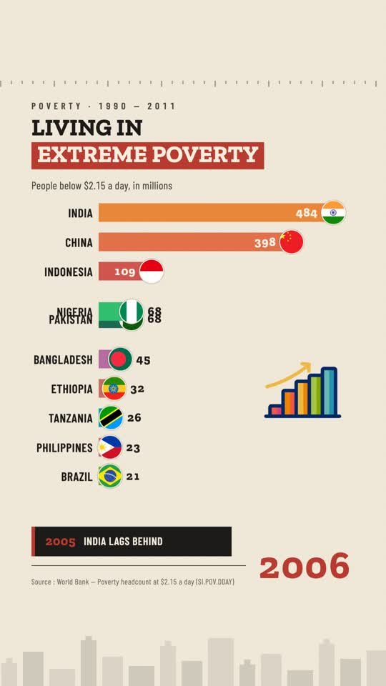
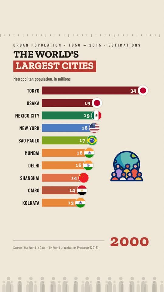
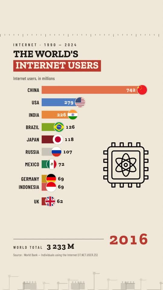
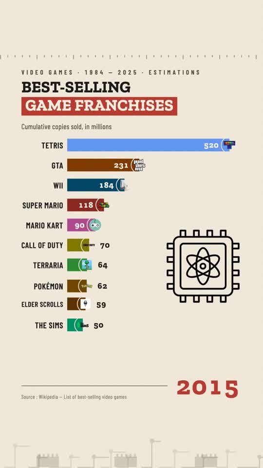
Every visual is a public dataset turned into an honest, animated infographic — sourced on screen, no number invented.
Historical statistics as animated infographics — and a trivia game built from real, sourced charts. How well do you actually know the numbers?
New chart every week · Our World in Data · Maddison · SIPRI (CC BY)
Same globe, any subject — climate, population, spending, arsenals.
Hover a country to place it on the globe · subjects rotate automatically
Not videos — charts you drive. Pick a dataset and scrub through the years; hover any curve to read the exact figure behind it.
Every visual is a public dataset turned into an honest, animated infographic — sourced on screen, no number invented.
Six we didn't see coming.